ページの作成
親となるページを選択してください。

親ページに紐づくページを子ページといいます。
例: 親=スポーツ, 子1=サッカー, 子2=野球
子ページを親ページとして更に子ページを作成することも可能です。
例: 親=サッカー, 子=サッカーのルール
親ページはいつでも変更することが可能なのでとりあえず作ってみましょう!
| この記事の要点 |
|
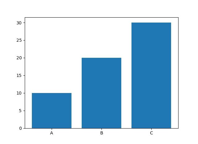
最も基本の棒グラフ
import matplotlib.pyplot as plt
x = ['A', 'B', 'C', 'D']
y = [10, 24, 17, 33]
plt.bar(x, y)
plt.xlabel('Category')
plt.ylabel('Value')
plt.title('Simple Bar Chart')
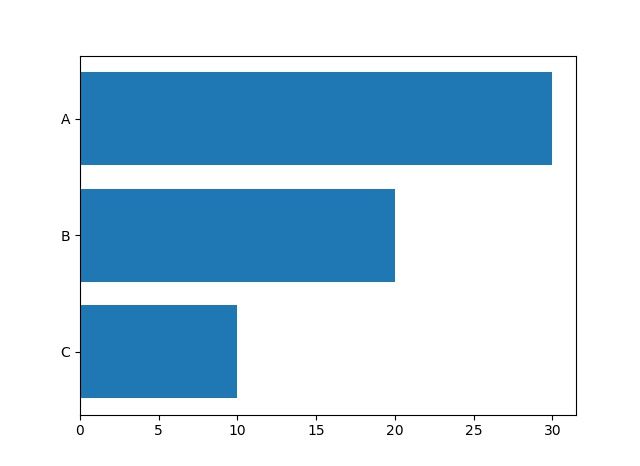
plt.show()横向き棒グラフ (barh)
カテゴリ名が長いとき、または値の順序を縦に並べたいときは barh が読みやすくなります。
import matplotlib.pyplot as plt

categories = ['Python', 'JavaScript', 'Java', 'C++', 'Go', 'Rust']
counts = [3500, 2800, 2100, 1500, 900, 600]

plt.barh(categories, counts, color='steelblue', edgecolor='black')
plt.xlabel('Number of Repositories')
plt.title('GitHub Trend (sample)')
plt.gca().invert_yaxis()    # 上から多い順
plt.tight_layout()
plt.show()
主なオプション
| 引数 | 役割 | 例 |
|---|---|---|
width | 棒の幅 (デフォルト 0.8) | width=0.5 |
color | 棒の色 (単色 / リスト) | color=['r','g','b'] |
edgecolor | 枠線の色 | edgecolor='black' |
linewidth | 枠線の太さ | linewidth=1.5 |
alpha | 透明度 (0-1) | alpha=0.7 |
yerr / xerr | エラーバー | yerr=[1,2,3,4] |
bottom | 棒の基準 (積み上げ用) | bottom=base |
hatch | パターン塗り | hatch='//' |
label | 凡例ラベル | label='2024' |
複数系列1: 並列 (grouped bar)
import matplotlib.pyplot as plt
import numpy as np

categories = ['Q1', 'Q2', 'Q3', 'Q4']
sales_2023 = [120, 150, 170, 200]
sales_2024 = [140, 165, 185, 230]

x = np.arange(len(categories))
width = 0.35

fig, ax = plt.subplots(figsize=(8, 5))
b1 = ax.bar(x - width/2, sales_2023, width, label='2023', color='#4C72B0')
b2 = ax.bar(x + width/2, sales_2024, width, label='2024', color='#DD8452')

ax.set_xticks(x)
ax.set_xticklabels(categories)
ax.set_ylabel('Sales (k USD)')
ax.set_title('Quarterly Sales')
ax.legend()

# 値ラベル (Matplotlib 3.4+)
ax.bar_label(b1, padding=3)
ax.bar_label(b2, padding=3)

plt.tight_layout()
plt.show()
複数系列2: 積み上げ (stacked bar)
import matplotlib.pyplot as plt
import numpy as np

categories = ['Mon', 'Tue', 'Wed', 'Thu', 'Fri']
morning   = [5, 7, 6, 8, 4]
afternoon = [3, 4, 5, 6, 5]
evening   = [2, 3, 2, 4, 6]

fig, ax = plt.subplots()
ax.bar(categories, morning,   label='Morning',   color='#1f77b4')
ax.bar(categories, afternoon, bottom=morning,    label='Afternoon', color='#ff7f0e')

bottom2 = np.array(morning) + np.array(afternoon)
ax.bar(categories, evening,   bottom=bottom2,    label='Evening',  color='#2ca02c')

ax.set_ylabel('Sessions')
ax.set_title('Daily Activity (stacked)')
ax.legend()
plt.show()
カラーマップで連続的に色付け
import matplotlib.pyplot as plt
import numpy as np

x = np.arange(10)
y = np.random.randint(20, 100, 10)

# 値の大小をそのままグラデーションに
colors = plt.cm.viridis(y / y.max())

plt.bar(x, y, color=colors, edgecolor='black')
plt.title('Bar with Colormap')
plt.show()
値ラベル (bar_label)
Matplotlib 3.4 以降で ax.bar_label(bars) が使えます。フォーマット指定や位置調整もできます。
import matplotlib.pyplot as plt

x = ['A', 'B', 'C']
y = [12.3, 45.6, 78.9]

fig, ax = plt.subplots()
bars = ax.bar(x, y, color='teal')

# 値を表示 (小数 1 桁 + 単位)
ax.bar_label(bars, fmt='%.1f %%', padding=3)

# 3.3 以前は自分で text を打つ
# for bar in bars:
#     h = bar.get_height()
#     ax.text(bar.get_x() + bar.get_width()/2, h + 1,
#             f'{h:.1f}', ha='center', va='bottom')

ax.set_ylim(0, max(y) * 1.15)
plt.show()
エラーバー付き棒グラフ
import matplotlib.pyplot as plt

x = ['Model A', 'Model B', 'Model C']
mean = [0.82, 0.87, 0.91]
std  = [0.03, 0.02, 0.04]

plt.bar(x, mean, yerr=std, capsize=8, color='lightcoral', edgecolor='black')
plt.ylim(0.7, 1.0)
plt.ylabel('Accuracy')
plt.title('Model Comparison (with std)')
plt.show()
subplot で複数並べる
import matplotlib.pyplot as plt
import numpy as np

x = ['A', 'B', 'C', 'D']
y1 = [10, 20, 30, 40]
y2 = [15, 25, 20, 35]

fig, axes = plt.subplots(1, 2, figsize=(10, 4))

axes[0].bar(x, y1, color='steelblue')
axes[0].set_title('Group 1')

axes[1].bar(x, y2, color='darkorange')
axes[1].set_title('Group 2')

plt.tight_layout()
plt.show()
pandas DataFrame から
import pandas as pd
import matplotlib.pyplot as plt

df = pd.read_csv('sales.csv')
# columns: ['quarter', '2023', '2024']

# DataFrame.plot は内部で Matplotlib を呼ぶ
df.set_index('quarter').plot(kind='bar', figsize=(8, 5))
plt.ylabel('Sales')
plt.title('Quarterly Sales')
plt.tight_layout()
plt.show()
Seaborn との比較
Seaborn の barplot は Matplotlib の上のラッパーで、より統計的な集計を内蔵します:
import seaborn as sns
import matplotlib.pyplot as plt

tips = sns.load_dataset('tips')
sns.barplot(data=tips, x='day', y='total_bill', hue='sex',
            estimator='mean', errorbar='ci')   # 平均 + 95% 信頼区間
plt.show()
使い分け: 細かな見た目を制御したい→Matplotlib、カテゴリ別の集計を一発で→Seaborn。
FAQ
Q: 横軸ラベルが重なって読めない
A: plt.xticks(rotation=45, ha='right') で斜めに、または fig.autofmt_xdate()。
Q: 棒の順序を値順にしたい
A: 事前にデータをソートします。sorted(zip(x, y), key=lambda p: p[1], reverse=True)。
Q: 棒の幅を揃えたい / 不揃いの x にしたい
A: x に数値を渡し width を統一。カテゴリ名は plt.xticks(positions, labels) で別途設定。
📸 参考画像
※ 旧バージョンから引き継いだ参考画像です。手順・図解の補助としてご覧ください。
ページの作成
親となるページを選択してください。
親ページに紐づくページを子ページといいます。
例: 親=スポーツ, 子1=サッカー, 子2=野球
子ページを親ページとして更に子ページを作成することも可能です。
例: 親=サッカー, 子=サッカーのルール
親ページはいつでも変更することが可能なのでとりあえず作ってみましょう!
子ページ
子ページはありません
人気ページ
- 1 Eclipseで「サーバーに追加または除去できるリソースがありません。」の原因と対処法
- 2 tomcat の起動 / 停止ログと catalina.log・catalina.out の違い
- 3 JavaScript base URL 取得方法|window.location.origin と SSR/Node.js 対応
- 4 YouTube Data API v3 エラー一覧|403/400/404 の主要原因と切り分け
- 5 Spring Frameworkのアノテーション一覧
- 6 Laravel エラー一覧|500/Blade/DB 接続/ルーティングの代表エラー
- 7 3Dグラフィックスとは|モデリング/レンダリング/主要ソフトウェア (Blender / Maya)
- 8 【Spring】@Valueアノテーションとは
- 9 CATALINA_HOME の確認方法 (Linux / Mac)
- 10 【Spring】@Autowiredアノテーションとは
最近更新/作成されたページ
- IPv6とは|128bitアドレス・コロン16進表記/::省略・リンクローカル・SLAAC・デュアルスタック 2026-06-22 12:34:44
- MAC アドレスフィルタリングの仕組みと限界 | ネットワーク入門 2026-06-22 12:19:10
- VPNとは|暗号トンネル・サイト間/リモートアクセス・IPsec/SSL-VPN/WireGuardを解説 2026-06-22 12:19:10
- HTTP/2 とは 多重化・HPACK・バイナリフレーム | ネットワーク入門 2026-06-22 12:17:25
- gRPC とは HTTP/2 + Protocol Buffers の高速 RPC | ネットワーク入門 2026-06-22 12:17:25
- WebSocket とは 全二重リアルタイム通信 ws/wss | ネットワーク入門 2026-06-22 12:17:25
- WebRTC とは ブラウザ間 P2P の音声・映像・データ通信 | ネットワーク入門 2026-06-22 12:17:25
- HTTP/3 (QUIC) とは UDP ベースの低遅延 Web 通信 | ネットワーク入門 2026-06-22 12:17:25
- Web通信プロトコル入門 HTTP/2・HTTP/3・WebSocket・gRPC・WebRTC | ネットワーク入門 2026-06-22 12:17:25
- HAProxy とは frontend/backend と設定例 | ネットワーク入門 2026-06-22 12:17:24
- iptables/nftablesとは|テーブル・チェーン・ルール例・永続化をLinux視点で解説 2026-06-22 12:17:24
- CDN とは エッジキャッシュ・TTL・Cloudflare/CloudFront | ネットワーク入門 2026-06-22 12:17:24
- TLS/SSLの仕組み|ハンドシェイク・暗号スイート・前方秘匿性・証明書検証をわかりやすく解説 2026-06-22 12:17:24
- ファイアウォールとは|パケットフィルタ・ステートフル・DMZ・次世代FW(L4/L7)を解説 2026-06-22 12:17:24
- 証明書と認証局(CA)とは|X.509・信頼チェーン・DV/OV/EV・失効(CRL/OCSP)を解説 2026-06-22 12:17:24
コメントを削除してもよろしいでしょうか?