| この記事の要点 |
|
最も基本の棒グラフ
import matplotlib.pyplot as plt

x = ['A', 'B', 'C', 'D']
y = [10, 24, 17, 33]

plt.bar(x, y)
plt.xlabel('Category')
plt.ylabel('Value')
plt.title('Simple Bar Chart')
plt.show()
横向き棒グラフ (barh)
カテゴリ名が長いとき、または値の順序を縦に並べたいときは barh が読みやすくなります。
import matplotlib.pyplot as plt

categories = ['Python', 'JavaScript', 'Java', 'C++', 'Go', 'Rust']
counts = [3500, 2800, 2100, 1500, 900, 600]

plt.barh(categories, counts, color='steelblue', edgecolor='black')
plt.xlabel('Number of Repositories')
plt.title('GitHub Trend (sample)')
plt.gca().invert_yaxis()    # 上から多い順
plt.tight_layout()
plt.show()
主なオプション
| 引数 | 役割 | 例 |
|---|---|---|
width | 棒の幅 (デフォルト 0.8) | width=0.5 |
color | 棒の色 (単色 / リスト) | color=['r','g','b'] |
edgecolor | 枠線の色 | edgecolor='black' |
linewidth | 枠線の太さ | linewidth=1.5 |
alpha | 透明度 (0-1) | alpha=0.7 |
yerr / xerr | エラーバー | yerr=[1,2,3,4] |
bottom | 棒の基準 (積み上げ用) | bottom=base |
hatch | パターン塗り | hatch='//' |
label | 凡例ラベル | label='2024' |
複数系列1: 並列 (grouped bar)
import matplotlib.pyplot as plt
import numpy as np

categories = ['Q1', 'Q2', 'Q3', 'Q4']
sales_2023 = [120, 150, 170, 200]
sales_2024 = [140, 165, 185, 230]

x = np.arange(len(categories))
width = 0.35

fig, ax = plt.subplots(figsize=(8, 5))
b1 = ax.bar(x - width/2, sales_2023, width, label='2023', color='#4C72B0')
b2 = ax.bar(x + width/2, sales_2024, width, label='2024', color='#DD8452')

ax.set_xticks(x)
ax.set_xticklabels(categories)
ax.set_ylabel('Sales (k USD)')
ax.set_title('Quarterly Sales')
ax.legend()

# 値ラベル (Matplotlib 3.4+)
ax.bar_label(b1, padding=3)
ax.bar_label(b2, padding=3)

plt.tight_layout()
plt.show()
複数系列2: 積み上げ (stacked bar)
import matplotlib.pyplot as plt
import numpy as np

categories = ['Mon', 'Tue', 'Wed', 'Thu', 'Fri']
morning   = [5, 7, 6, 8, 4]
afternoon = [3, 4, 5, 6, 5]
evening   = [2, 3, 2, 4, 6]

fig, ax = plt.subplots()
ax.bar(categories, morning,   label='Morning',   color='#1f77b4')
ax.bar(categories, afternoon, bottom=morning,    label='Afternoon', color='#ff7f0e')

bottom2 = np.array(morning) + np.array(afternoon)
ax.bar(categories, evening,   bottom=bottom2,    label='Evening',  color='#2ca02c')

ax.set_ylabel('Sessions')
ax.set_title('Daily Activity (stacked)')
ax.legend()
plt.show()
カラーマップで連続的に色付け
import matplotlib.pyplot as plt
import numpy as np

x = np.arange(10)
y = np.random.randint(20, 100, 10)

# 値の大小をそのままグラデーションに
colors = plt.cm.viridis(y / y.max())

plt.bar(x, y, color=colors, edgecolor='black')
plt.title('Bar with Colormap')
plt.show()
値ラベル (bar_label)
Matplotlib 3.4 以降で ax.bar_label(bars) が使えます。フォーマット指定や位置調整もできます。
import matplotlib.pyplot as plt

x = ['A', 'B', 'C']
y = [12.3, 45.6, 78.9]

fig, ax = plt.subplots()
bars = ax.bar(x, y, color='teal')

# 値を表示 (小数 1 桁 + 単位)
ax.bar_label(bars, fmt='%.1f %%', padding=3)

# 3.3 以前は自分で text を打つ
# for bar in bars:
#     h = bar.get_height()
#     ax.text(bar.get_x() + bar.get_width()/2, h + 1,
#             f'{h:.1f}', ha='center', va='bottom')

ax.set_ylim(0, max(y) * 1.15)
plt.show()
エラーバー付き棒グラフ
import matplotlib.pyplot as plt

x = ['Model A', 'Model B', 'Model C']
mean = [0.82, 0.87, 0.91]
std  = [0.03, 0.02, 0.04]

plt.bar(x, mean, yerr=std, capsize=8, color='lightcoral', edgecolor='black')
plt.ylim(0.7, 1.0)
plt.ylabel('Accuracy')
plt.title('Model Comparison (with std)')
plt.show()
subplot で複数並べる
import matplotlib.pyplot as plt
import numpy as np

x = ['A', 'B', 'C', 'D']
y1 = [10, 20, 30, 40]
y2 = [15, 25, 20, 35]

fig, axes = plt.subplots(1, 2, figsize=(10, 4))

axes[0].bar(x, y1, color='steelblue')
axes[0].set_title('Group 1')

axes[1].bar(x, y2, color='darkorange')
axes[1].set_title('Group 2')

plt.tight_layout()
plt.show()
pandas DataFrame から
import pandas as pd
import matplotlib.pyplot as plt

df = pd.read_csv('sales.csv')
# columns: ['quarter', '2023', '2024']

# DataFrame.plot は内部で Matplotlib を呼ぶ
df.set_index('quarter').plot(kind='bar', figsize=(8, 5))
plt.ylabel('Sales')
plt.title('Quarterly Sales')
plt.tight_layout()
plt.show()
Seaborn との比較
Seaborn の barplot は Matplotlib の上のラッパーで、より統計的な集計を内蔵します:
import seaborn as sns
import matplotlib.pyplot as plt

tips = sns.load_dataset('tips')
sns.barplot(data=tips, x='day', y='total_bill', hue='sex',
            estimator='mean', errorbar='ci')   # 平均 + 95% 信頼区間
plt.show()
使い分け: 細かな見た目を制御したい→Matplotlib、カテゴリ別の集計を一発で→Seaborn。
FAQ
Q: 横軸ラベルが重なって読めない
A: plt.xticks(rotation=45, ha='right') で斜めに、または fig.autofmt_xdate()。
Q: 棒の順序を値順にしたい
A: 事前にデータをソートします。sorted(zip(x, y), key=lambda p: p[1], reverse=True)。
Q: 棒の幅を揃えたい / 不揃いの x にしたい
A: x に数値を渡し width を統一。カテゴリ名は plt.xticks(positions, labels) で別途設定。
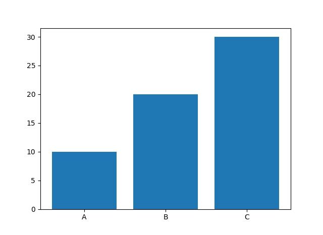
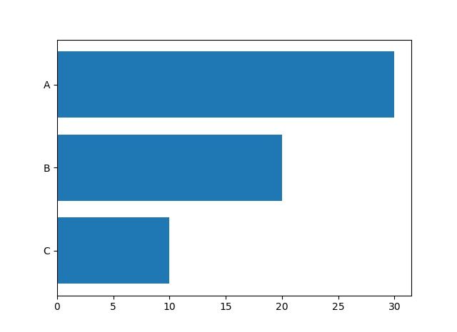
📸 参考画像
※ 旧バージョンから引き継いだ参考画像です。手順・図解の補助としてご覧ください。
子ページ
子ページはありません
人気ページ
- 1 Eclipseで「サーバーに追加または除去できるリソースがありません。」の原因と対処法
- 2 tomcat の起動 / 停止ログと catalina.log・catalina.out の違い
- 3 JavaScript で base URL を取得する方法|window.location.origin
- 4 YouTube Data API v3 エラー一覧|403・400・404 の原因と対処
- 5 Laravel エラー一覧|500/Blade/DB 接続/ルーティングの代表エラー
- 6 3Dグラフィックスとは|モデリング/レンダリング/主要ソフトウェア (Blender / Maya)
- 7 Spring Frameworkのアノテーション一覧
- 8 【Spring】@Valueアノテーションとは
- 9 CATALINA_HOME の確認方法 (Linux / Mac)
- 10 【Spring】@Autowiredアノテーションとは
最近更新/作成されたページ
- Git pushした変更の取消し|revert・履歴変更と保護の注意点 2026-10-15 23:49:01
- Gitでローカルを戻す前に|reset・restoreの違いと退避範囲 2026-10-15 23:49:01
- Git rebaseの使い方|対象範囲・競合解決・pushの判断 2026-10-15 22:50:59
- Git pullの使い方|取込み先・ff-only・競合とstashの注意点 2026-10-15 22:50:59
- Git pushの使い方|送信先・タグ・force-with-leaseの条件 2026-10-15 22:12:47
- Git remoteの設定・確認・削除|SSH URLとfetch/pushの違い 2026-10-15 22:12:47
- Gitリモートリポジトリの作成|初回push・既存履歴・mirrorの注意 2026-10-15 15:48:16
- Gitのuser.name・user.email設定|local/global・確認と過去履歴の注意 2026-10-15 15:30:07
- LinuxにGitをインストール|配布元・初期設定・TLSと認証の確認 2026-10-15 15:30:06
- Git導入と初回push|Linuxサーバー・Windows/macOS・SSH設定 2026-10-15 14:51:54
- Db2のCREATE INDEX|索引定義・INCLUDEと実行計画の確認 2026-10-15 14:10:22
- Db2の自動採番|IDENTITY・ID取得とRESTARTの注意点 2026-10-15 14:10:22
- 【DB2】特定スキーマの全テーブルの全カラム情報を取得する方法 2026-10-15 13:53:15
- Db2のシーケンスとIDENTITYの違い|採番とカタログの確認SQL 2026-10-15 13:53:15
- Db2で複数カラムをUPDATEする方法|SET・WHEREと更新前の値 2026-10-15 13:53:15