タイトル: パスワードを一時的に表示させる方法
SEOタイトル: 「目玉アイコン」でパスワード入力欄を一時的に表示する実装(HTML / JS / Bootstrap / Blade)
| この記事の要点 |
|
基本実装(素の HTML + JavaScript)
<!DOCTYPE html>
<html lang="ja">
<head><meta charset="UTF-8"><title>パスワード一時表示</title></head>
<body>
  <label for="pw">パスワード</label>
  <input type="password" id="pw" name="password" />
  <button type="button" id="toggle">表示</button>

  <script>
    const pw = document.getElementById('pw');
    const btn = document.getElementById('toggle');
    btn.addEventListener('click', () => {
      if (pw.type === 'password') {
        pw.type = 'text';
        btn.textContent = '隠す';
      } else {
        pw.type = 'password';
        btn.textContent = '表示';
      }
    });
  </script>
</body>
</html>
目玉アイコン UI(Font Awesome)
<link rel="stylesheet" href="https://cdnjs.cloudflare.com/ajax/libs/font-awesome/6.4.0/css/all.min.css">

<style>
  .pw-wrap { position: relative; display: inline-block; }
  .pw-wrap input { padding-right: 32px; }
  .pw-toggle {
    position: absolute; right: 8px; top: 50%;
    transform: translateY(-50%);
    cursor: pointer; background: none; border: none;
    color: #666;
  }
</style>

<div class="pw-wrap">
  <input type="password" id="pw" placeholder="パスワード" />
  <button type="button" class="pw-toggle" id="toggle" aria-label="パスワードを表示">
    <i class="fa-solid fa-eye"></i>
  </button>
</div>

<script>
  const pw = document.getElementById('pw');
  const btn = document.getElementById('toggle');
  const icon = btn.querySelector('i');
  btn.addEventListener('click', () => {
    const isHidden = pw.type === 'password';
    pw.type = isHidden ? 'text' : 'password';
    icon.className = isHidden ? 'fa-solid fa-eye-slash' : 'fa-solid fa-eye';
    btn.setAttribute('aria-label', isHidden ? 'パスワードを隠す' : 'パスワードを表示');
  });
</script>
Bootstrap 5 の input-group で実装
<link href="https://cdn.jsdelivr.net/npm/bootstrap@5.3.2/dist/css/bootstrap.min.css" rel="stylesheet">
<link rel="stylesheet" href="https://cdn.jsdelivr.net/npm/bootstrap-icons@1.11.1/font/bootstrap-icons.css">

<div class="mb-3">
  <label for="pw" class="form-label">パスワード</label>
  <div class="input-group">
    <input type="password" id="pw" class="form-control" placeholder="8 文字以上" />
    <button class="btn btn-outline-secondary" type="button" id="togglePw">
      <i class="bi bi-eye" id="togglePwIcon"></i>
    </button>
  </div>
</div>

<script>
  document.getElementById('togglePw').addEventListener('click', () => {
    const pw = document.getElementById('pw');
    const icon = document.getElementById('togglePwIcon');
    if (pw.type === 'password') {
      pw.type = 'text';
      icon.className = 'bi bi-eye-slash';
    } else {
      pw.type = 'password';
      icon.className = 'bi bi-eye';
    }
  });
</script>
Laravel Blade コンポーネント化
{{-- resources/views/components/password-input.blade.php --}}
@props(['name' => 'password', 'label' => 'パスワード', 'placeholder' => null])

<div class="mb-3">
  <label for="{{ $name }}" class="form-label">{{ $label }}</label>
  <div class="input-group">
    <input type="password"
           id="{{ $name }}"
           name="{{ $name }}"
           class="form-control @error($name) is-invalid @enderror"
           placeholder="{{ $placeholder }}"
           value="{{ old($name) }}" />
    <button class="btn btn-outline-secondary toggle-pw" type="button" data-target="{{ $name }}">
      <i class="bi bi-eye"></i>
    </button>
    @error($name)
      <div class="invalid-feedback">{{ $message }}</div>
    @enderror
  </div>
</div>
// resources/js/password-toggle.js(layouts で読み込む)
document.addEventListener('click', (e) => {
const btn = e.target.closest('.toggle-pw');
if (!btn) return;
const targetId = btn.dataset.target;
const input = document.getElementById(targetId);
const icon = btn.querySelector('i');
if (input.type === 'password') {
input.type = 'text';
icon.classList.replace('bi-eye', 'bi-eye-slash');
} else {
input.type = 'password';
icon.classList.replace('bi-eye-slash', 'bi-eye');
}
});使い方:
{{-- ログイン画面で --}}
<form method="POST" action="/login">
  @csrf
  <input type="email" name="email" class="form-control" placeholder="メール" />
  <x-password-input name="password" label="パスワード" placeholder="8 文字以上" />
  <button type="submit" class="btn btn-primary">ログイン</button>
</form>
React での実装例
import { useState } from 'react';

export function PasswordInput({ name = 'password', label = 'パスワード' }) {
  const [visible, setVisible] = useState(false);
  return (
    <div className="input-group">
      <input
        type={visible ? 'text' : 'password'}
        name={name}
        className="form-control"
      />
      <button
        type="button"
        className="btn btn-outline-secondary"
        onClick={() => setVisible(!visible)}
        aria-label={visible ? 'パスワードを隠す' : 'パスワードを表示'}
      >
        <i className={visible ? 'bi bi-eye-slash' : 'bi bi-eye'}></i>
      </button>
    </div>
  );
}
長押しで一時表示(押している間だけ)
<input type="password" id="pw" />
<button type="button" id="peek">押すと表示</button>

<script>
  const pw = document.getElementById('pw');
  const btn = document.getElementById('peek');
  const show = () => pw.type = 'text';
  const hide = () => pw.type = 'password';
  btn.addEventListener('mousedown', show);
  btn.addEventListener('touchstart', show);
  btn.addEventListener('mouseup', hide);
  btn.addEventListener('mouseleave', hide);
  btn.addEventListener('touchend', hide);
</script>
セキュリティ上の注意点
| 注意点 | 説明 |
|---|---|
| ショルダーハッキング | 公共の場・オンライン会議の画面共有時に注意。一時表示中は背後を確認 |
| 長時間表示しない | 一定秒数(例: 5 秒)で自動的に隠す実装を推奨 |
| ログイン画面以外では使わない | 登録フォームの確認用は許容、ログイン画面では推奨しない場面も |
| autocomplete 属性 | autocomplete="current-password" でパスワードマネージャ連携 |
| クリップボードコピー検知 | サーバー側でログイン後にコピー通知を出すなどは過剰サービスになりがち |
自動で隠す実装
const pw = document.getElementById('pw');
const btn = document.getElementById('toggle');
let timer;

btn.addEventListener('click', () => {
  if (pw.type === 'password') {
    pw.type = 'text';
    clearTimeout(timer);
    // 5 秒後に自動で隠す
    timer = setTimeout(() => {
      pw.type = 'password';
    }, 5000);
  } else {
    pw.type = 'password';
    clearTimeout(timer);
  }
});
アクセシビリティ対応
- ボタンには必ず
aria-labelを付与(「パスワードを表示」「パスワードを隠す」) - キーボード操作対応(
tabindexでフォーカス順、Space / Enter で切替) - スクリーンリーダーで切替が伝わるよう
aria-pressed属性を更新 - 色のみで状態を伝えない(アイコン形状で識別可能に)
FAQ
Q: パスワードマネージャと干渉しないか?
A: type を切り替えても自動入力は機能します。autocomplete="current-password" / "new-password" を正しく指定してください。
Q: スマホ画面で一時表示しても短時間で隠したい
A: 上記「自動で隠す実装」を採用。スマホは画面が小さく覗き見されにくい代わり、画面録画リスクがあるので 3〜5 秒程度に抑制。
Q: 既存のパスワード入力欄に一括適用したい
A: document.querySelectorAll("input[type=password]") でループしてラッパー要素と切替ボタンを動的挿入する関数を用意し、全ページで読み込む JS にすると一元管理できます。
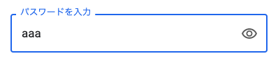
📸 参考画像
※ 旧バージョンから引き継いだ参考画像です。手順・図解の補助としてご覧ください。